This week we rolled out a new website and brand for Digital Green: a new logo, a new look, and a much bolder shade of green. It’s the first real redesign in years, and it arrives at a moment when what we do is evolving.
The idea we kept coming back to was that AI doesn’t have to look like “AI.” No glowing gradients, no floating orbs, no chrome robots. Our work is deeply human, and the farmers at the center of it aren’t looking for any of that. They’re looking for help with their crops and their livestock, in the language they actually speak. Every design decision had to earn its place against that.
Looking back to look forward
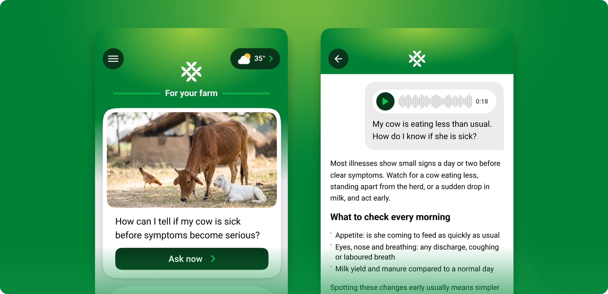
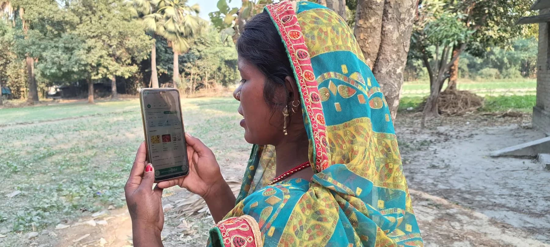
For most of our eighteen years, Digital Green did one thing, stubbornly well. Starting in 2008, we handed farmers cameras and let them film what actually worked in their own fields, then gathered whole villages to watch. It was human, it was affordable, and it spread to hundreds of thousands of farmers across India and East Africa. Then in 2023 we did something genuinely different. FarmerChat isn’t a faster version of that playbook; it’s a new one. It’s an AI assistant a farmer can simply talk to, out loud, in their own language, and get a real answer in the moment. That shift, from making media to building a product, is a big part of why the brand had to grow up too.
Making it feel human
The goal was simple enough: a brand that feels genuinely human, unintimidating, and unmistakably ours. So we didn’t start with a logo or a mood board. We started with the one thing we already owned outright. The color.
It starts with the green
Green was the obvious place to begin, because it’s the name. The old green served us well for a long time; it was calm and dependable, and it carried the work through a lot of growth. But this is a new chapter, and it called for more energy. The new green is bolder and brighter, with a lot of yellow pushed into it, so it reads like fields and afternoon sun. It’s the most confident version of the color we’ve ever used, and once we landed it, almost everything else arranged itself around it. When a brand rests on a single strong idea, most of the craft is in not getting in its way.
The wordmark follows the same instinct. We set “Digital Green” plainly and let it sit with quiet confidence: no clever ligatures, no mascot, nothing asking to be decoded. Against the bright green it behaves more like a flag than a logo, which is exactly what we were after. A name you trust, not a puzzle you solve.
The quiet craft
For everything else we chose Figtree, a warm, humanist typeface from Google Fonts that feels like a person talking rather than a system printing. It’s friendly and open, confident at large sizes and steady at small ones. We kept the weights few and the sizes deliberate, so hierarchy comes from restraint rather than decoration.
Under the surface, everything is built from one small kit of parts. The same spacing, the same corner radii, the same handful of color tokens, reused on every page. It’s the least glamorous part of a redesign and probably the most important: it’s what makes a site feel like one considered object rather than a stack of unrelated screens. When the system is doing its job, you don’t notice it at all. You just feel that the thing holds together.
One last thing: Green Mode
Instead of the usual dark mode, we made something we simply love: Green Mode. Look for the small sprout button up in the header, give it a tap, and the whole site sinks into a deep, saturated green, like the brand seen at dusk. It’s a small, joyful moment that could only belong to Digital Green, and honestly, it’s one of our favorite parts of the whole thing.
What didn’t change
The method has changed a lot over the years. Video, then phones, now AI. The belief underneath it hasn’t moved: the best knowledge for a farmer already lives in farming communities, and technology’s only job is to help it travel further and faster. The new brand finally looks like that belief. Human, direct, and rooted in the field.
One honest note: a brand this size doesn’t land everywhere at once. For a while you’ll still catch the old look in places, on a social profile, an old slide, a partner’s page, while everything catches up. If it feels a little inconsistent for a bit, that’s why.
The look is new. So is the direction. And after eighteen years, it feels like we’re just getting started. Come take a look.